When a product is made by many teams, small inconsistencies pile up quietly — three type sizes that should be one, spacing chosen by feel, colours nudged by hand until dark mode and light mode no longer agree. Across MailOnline this had started to fragment the experience and to cost the team repeated work.
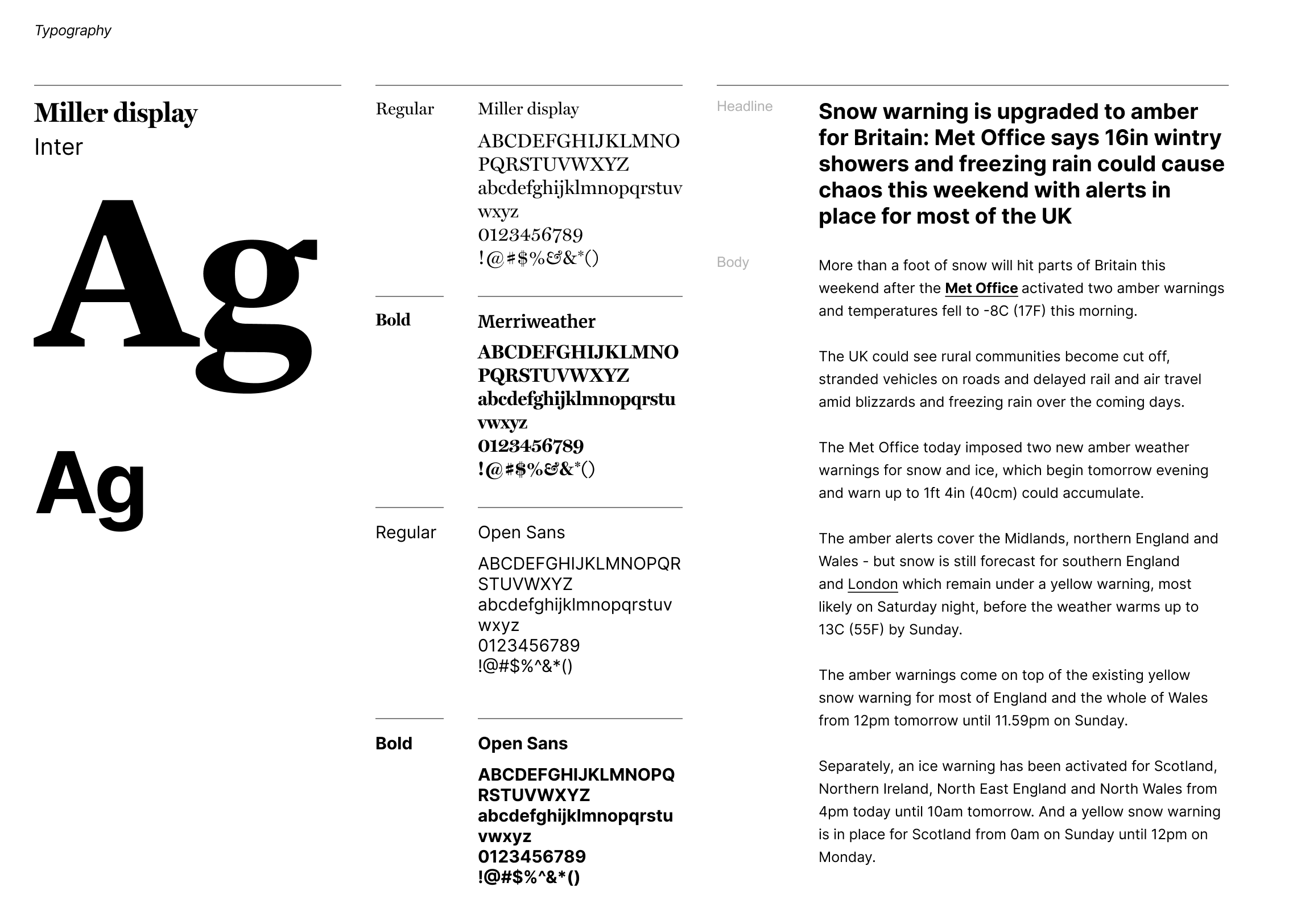
I led the rebuild from the core out. Typography first, into a clear and scalable hierarchy tuned for editorial reading, mobile performance and brand — then colour, spacing, radius and elevation, all defined once as tokens rather than values.
Bring clarity and cohesion back to a fast-paced news product without slowing anyone down — and make the system something a large, busy team would actually adopt.
- 01
Type first
A single, scalable type hierarchy, optimised for editorial readability and for reading on a phone, that holds the brand together across every content format. - 02
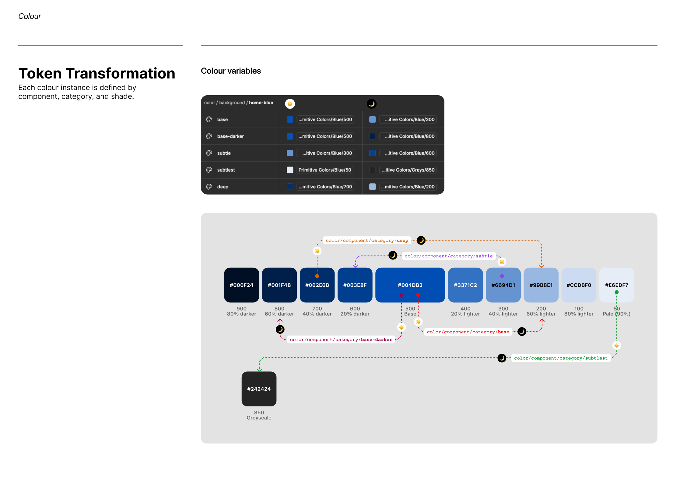
Tokens, not values
Colour, spacing, radius and elevation defined as design tokens in Figma, mapped to CSS variables — so the UI scales responsively and developers implement it directly. - 03
Frame the media
Clear ratios and framing rules for editorial thumbnails, featured media and inline content, so the page stays balanced across every viewport. - 04
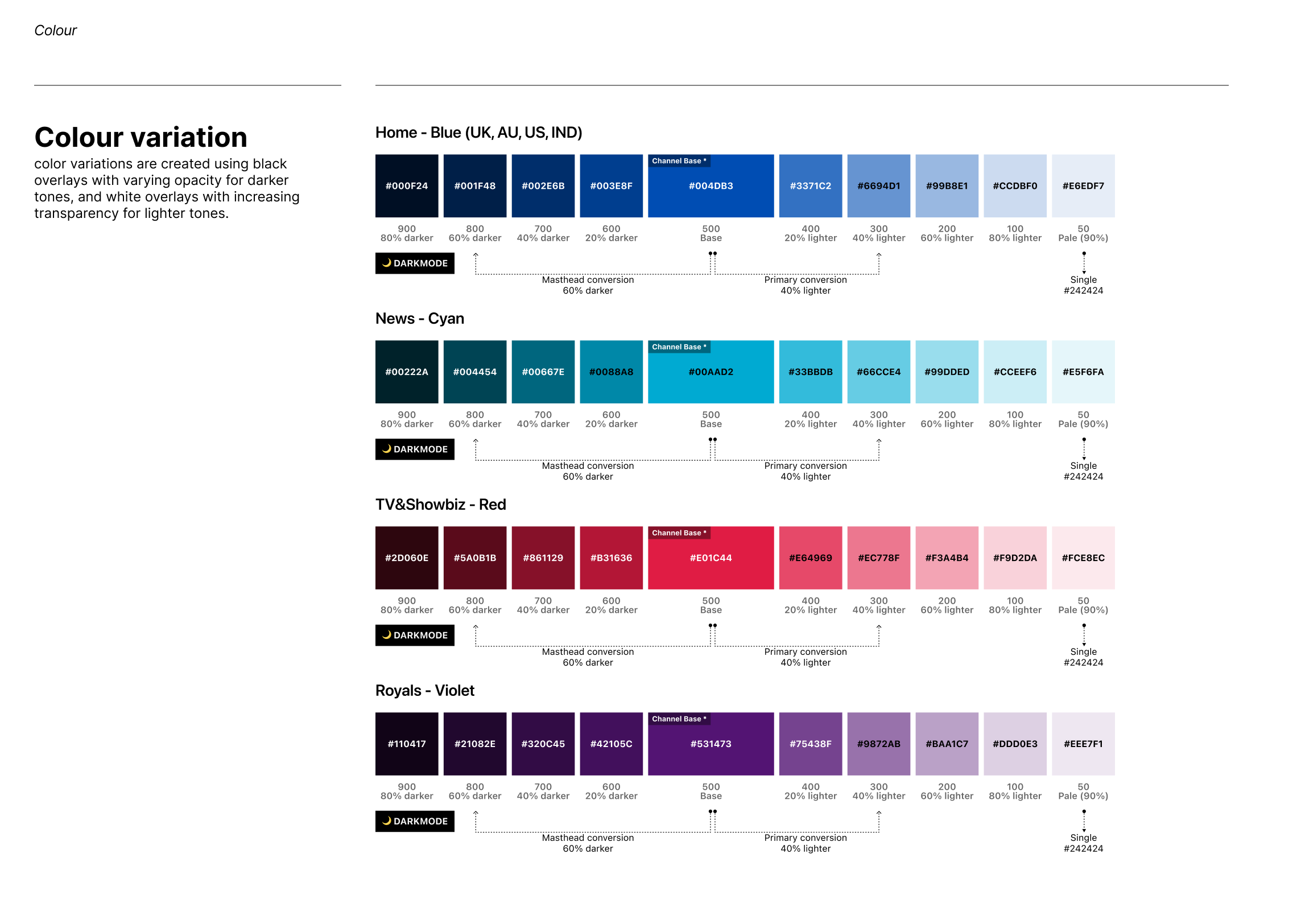
One theme system
Standardised colour across components and themes, which made dark and light mode simple to manage instead of a source of conflict.
“By the end it was not just a set of components. It became a shared foundation — so designers, developers and editors could build the same way, and ship with confidence.”
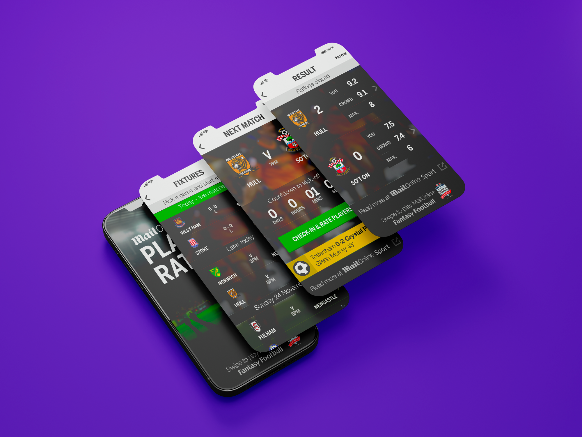
The system became a shared foundation for designers, developers and content creators — faster onboarding, less redundant work, and a consistent, higher-quality experience across web, mobile and native apps.
- ↳Unified type scale and hierarchy
- ↳Design token system (Figma → CSS variables)
- ↳Standardised colour and theming
- ↳Editorial media framing rules
- ↳System documentation